
Most small business owners think a good-looking website means more leads. That assumption is costing them money. Why web design affects lead quality goes far deeper than colors and fonts. Your site's structure, speed, clarity, and usability determine whether visitors trust you enough to make contact, and whether the people who do reach out are actually worth your time. This guide breaks down exactly how each layer of your web design influences the quality of the leads you receive, not just the volume.
Table of Contents
- Key takeaways
- Why web design affects lead quality from the first second
- Usability and navigation shape who contacts you
- Technical factors that complement design for stronger leads
- How design works as a pre-qualification filter
- Practical steps to improve your site for better lead quality
- My honest take on what design really does for your leads
- Ready to turn your website into a lead machine?
- FAQ
Key takeaways
| Point | Details |
|---|---|
| Design signals credibility fast | 75% of users judge your business credibility by your website design before reading a word. |
| Usability filters your leads | Clear navigation and simple conversion paths attract high-intent visitors and reduce wasted inquiries. |
| Speed is a lead quality factor | A one-second load delay can cut conversions by 7%, sending qualified buyers straight to a competitor. |
| Design pre-qualifies your audience | Strong visual hierarchy and clear messaging attract ideal customers and naturally discourage poor-fit inquiries. |
| Technical performance matters too | Mobile responsiveness, optimized forms, and trust signals work together to convert the right visitors into real leads. |
Why web design affects lead quality from the first second
Before anyone reads your headline, they have already made a judgment. Research shows 75% of users judge a business's credibility based on website design alone. That is not a small detail. That is the majority of your potential customers forming an opinion about your business before you say a single word.
For local service providers, this matters even more. A homeowner looking for a plumber, a landscaper, or a house cleaner is not browsing out of curiosity. They have a problem to solve. When they land on your website and it looks outdated, cluttered, or confusing, they do not pause and wonder if your service might still be good. They leave. They go to the next result.
Visual polish is not vanity. Good design signals operational maturity and business reliability. Prospects actively use design as a proxy for how competent and trustworthy you are. A clean, professional site communicates that you show up on time, do the job right, and are worth the money.
Here is what trust-building design actually looks like in practice:
- Clear, readable typography that does not require squinting
- Consistent color scheme that reflects your brand without looking chaotic
- High-quality photos of your actual work or team, not cheap stock images
- Visible contact information above the fold, not buried in the footer
- An SSL certificate and a privacy policy link, because missing trust signals cause real hesitation
Pro Tip: Add your phone number in the top right corner of every page. Local service leads expect to call. Making that number invisible is the single fastest way to lose a hot prospect.
Usability and navigation shape who contacts you
Getting someone to your site is one thing. What happens next determines the quality of your leads. Poor navigation does not just frustrate visitors. It filters out the wrong people in the wrong direction.
When a roofing contractor's website forces visitors to click through four pages just to find a quote form, two things happen. First, casual browsers and unqualified visitors might drop off entirely. Second, and this is the problem, highly motivated buyers who are ready to hire often leave too, because friction does not discriminate.
A well-structured site makes it easier for users to find what they need quickly. That speed of clarity is what separates a site that generates qualified calls from one that generates generic "how much do you charge?" emails that go nowhere.

Reducing cognitive load is the real goal. When someone lands on your page and immediately understands what you do, who you serve, and what to do next, you have set up a natural qualification filter. The people who engage with a clear offer are more likely to be ready to buy.
Pro Tip: Run your own website through Google's mobile usability test. You will almost certainly find at least one issue causing friction you never noticed on desktop.
A few usability changes that directly improve lead quality:
- Place a single, specific call to action on each page rather than five competing options
- Use service-specific landing pages so visitors self-select based on their exact need
- Mobile responsiveness is non-negotiable since mobile traffic converts 14% lower than desktop when the experience is broken
- Simplified forms with fewer fields get completed more often and by more committed visitors
When your site flows logically, the leads who come through already understand your offer. That is a better starting point for every conversation.
Technical factors that complement design for stronger leads
Design and technical performance are not separate conversations. They are the same conversation. A beautiful website that loads in five seconds is failing you just as much as an ugly one.
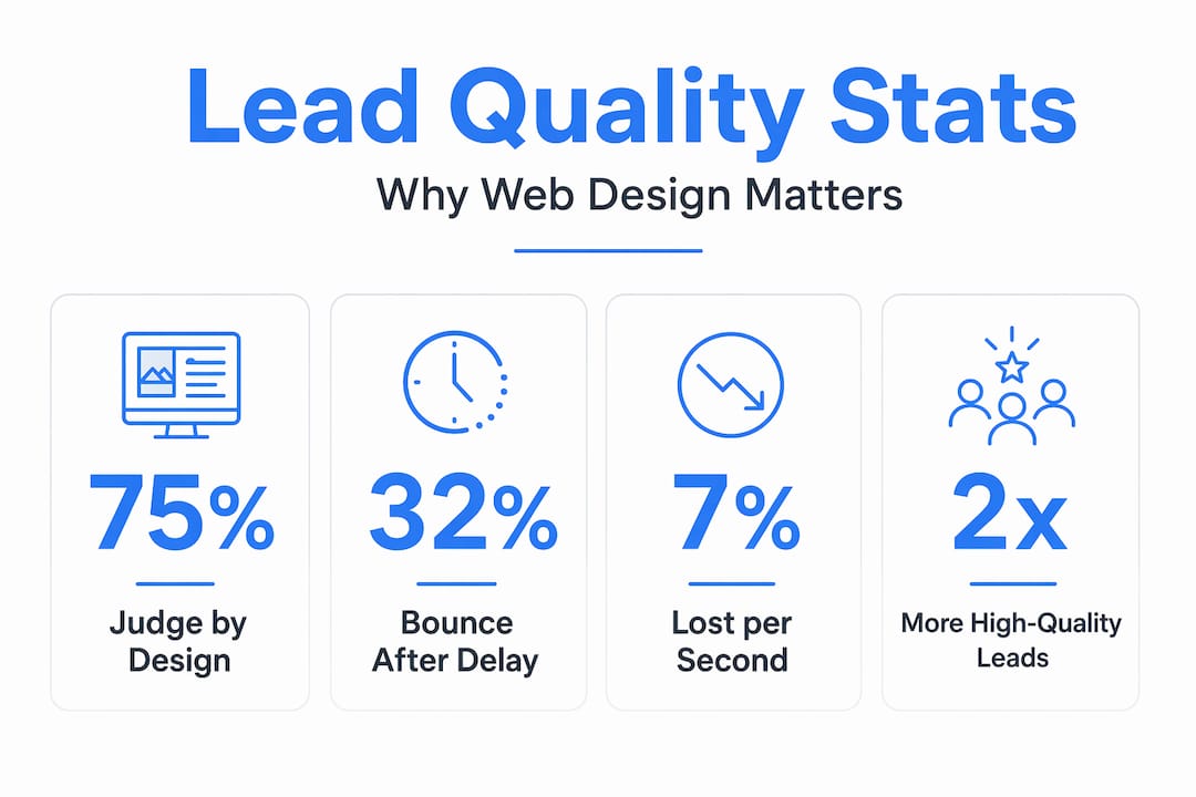
The numbers are blunt: a 1-second delay reduces conversions by 7%, and bounce probability increases by 32% when load time stretches from one second to three. That means slow sites are not just inconvenient. They are actively pushing away people who were ready to contact you.
Here is a breakdown of technical design factors and their direct impact on lead quality:
| Technical factor | Effect on lead quality |
|---|---|
| Page load speed under 2 seconds | Retains high-intent visitors who would otherwise bounce |
| Mobile-first layout | Captures the majority of local search traffic that converts on phones |
| Optimized contact forms | Shorter forms get more completions; multi-step forms boost completions by 35-50% |
| SSL certificate and trust badges | Reduces hesitation at the moment of form submission |
| CRM integration | Allows instant follow-up, which dramatically improves lead-to-client conversion |
Form design is underrated as a lead quality tool. Every additional field you add to a contact form reduces completion rates. The goal is not to collect every possible piece of data upfront. The goal is to get the right person to raise their hand. You can qualify further in the first phone call.
The top lead generation tactics for service businesses consistently emphasize removing friction from the inquiry process. Technical performance is a core part of that.
How design works as a pre-qualification filter
This is the part most business owners never think about. Your website is not just a marketing tool. It is a screening tool. The way it looks and communicates will naturally attract certain visitors and discourage others. Getting that filter calibrated correctly saves you hours of wasted sales conversations.
Think about the difference between two landscaping websites. One has a generic template with clip art, vague service descriptions, and no pricing signals. The other has professional photos of completed projects, clearly described premium services, and a "Request a Custom Quote" button. Both might get the same traffic. But they will not get the same leads.
Visual hierarchy communicates value quickly. When a prospect lands on a site that looks polished and organized, they self-select as a customer who expects quality and is prepared to pay for it. When they land on something that looks thrown together, the people who stay are often bargain shoppers or time-wasters.
Here is the contrast in practice:
| Low-quality design signals | High-quality design signals |
|---|---|
| Generic stock photos with no context | Real photos of completed jobs or your team |
| No stated service area or specialty | Clear service area and niche focus in the headline |
| Multiple competing calls to action | One clear primary CTA per page |
| No testimonials or reviews visible | Social proof front and center |
| Vague "Contact Us" form | Specific intake form with scoped questions |
"Design is not decoration. It is the first conversation you have with every potential customer. That conversation either earns their trust or loses their business before you ever pick up the phone."
UX and design serve as a pre-qualification filter by communicating value and positioning clearly, so the leads who submit a form already understand what you do and who you serve. That makes your close rate go up without you changing a single word of your sales script.
Practical steps to improve your site for better lead quality
Knowing the theory is one thing. Here is where you actually start. These steps are ordered by impact, so if you can only do a few, start at the top.
-
Audit your trust signals. Open your own website on your phone as if you are a new visitor. Is your phone number visible without scrolling? Do you have real photos, reviews, and a professional logo? Does the site look like a business you would call?
-
Simplify your navigation. If you have more than five items in your main menu, cut it down. Each extra option adds decision fatigue and reduces the chance a visitor takes the one action you actually want.
-
Rewrite your headline. Your homepage headline should say what you do, who you serve, and where you serve them. "Professional Lawn Care in Austin, TX" converts better than "Welcome to Our Website" every single time.
-
Check your mobile experience. Well-designed CTAs placed above the fold convert 304% better. On mobile, that means your call-to-action button needs to be visible without scrolling, and it needs to be large enough to tap comfortably.
-
Reduce form fields. Cut your contact form to three fields maximum for the first touchpoint: name, phone number, and a brief description of the job. You will get more completions, and the quality of those leads will not drop.
-
Run a speed test. Use Google PageSpeed Insights to check your load time. If your score is below 70, your design might look fine but your technical performance is killing your conversions.
Pro Tip: Ask three people who are unfamiliar with your business to visit your site and tell you what you do within ten seconds. If they cannot answer that correctly, your design is not working as a lead filter.
My honest take on what design really does for your leads
I have worked with enough service businesses to say this with confidence: most of them are losing good leads every single week, and their website is the reason.
What I have learned is that the owners who get the best results are not the ones who spent the most on design. They are the ones who understood that design has a job to do. Not to impress people. To convert them.
The mistake I see over and over is treating a website like a business card. You build it once, post it online, and hope it works. But a well-designed website is a system. It guides specific people through a specific journey and filters out everyone else. When it works right, you spend less time on the phone with people who are not ready to buy and more time closing deals with people who already trust you before you speak.
What the research reflects is something I have seen firsthand. Poor design creates doubt independent of how good your service actually is. A prospect cannot experience your work until they hire you. So your website is the only evidence they have. If that evidence looks weak, they move on.
The businesses I respect most treat their website the way they treat their equipment. They keep it sharp. They update it. They measure what it produces. That is the mindset that turns a website from a cost into a lead machine.
— Chandler
Ready to turn your website into a lead machine?
If this article made you look at your own site differently, that is a good sign. But looking is just the start.
At Leadmachinewebdesign, every project starts with one question: is this website going to bring in better leads? The team specializes in building high-converting websites for local service providers, including contractors, cleaners, landscapers, and beauty professionals. The focus is not on making your site look nice for its own sake. It is on building a site that earns trust in under five seconds, guides the right visitors to contact you, and filters out the ones who are not a real fit. You can see a free mockup before any work begins.
FAQ
How does web design affect lead quality directly?
Web design shapes first impressions, trust, and navigation clarity. When visitors trust your site and can easily find what they need, the leads who contact you are more informed, more motivated, and more likely to convert into paying customers.
Can bad design reduce lead conversions?
Yes. 75% of users judge credibility through design alone, and slow or confusing sites push high-intent visitors toward competitors. Bad design does not just reduce traffic quality. It eliminates leads before they ever reach your form.
What design elements most improve lead quality?
Clear headlines, visible contact options, simplified forms, mobile responsiveness, and social proof all directly improve lead quality. These elements attract serious buyers and give them a frictionless path to reach out.
Does mobile design really affect lead quality?
Absolutely. Mobile traffic is now the majority of local search visits, and poor mobile experience can eliminate up to 60% of your prospects before they ever see your contact form.
How often should I update my website design?
A full redesign every two to three years is a reasonable baseline, but you should review performance metrics quarterly. If your bounce rate is high or your form completion rate is low, that is a signal your design is creating friction that is hurting lead quality right now.